


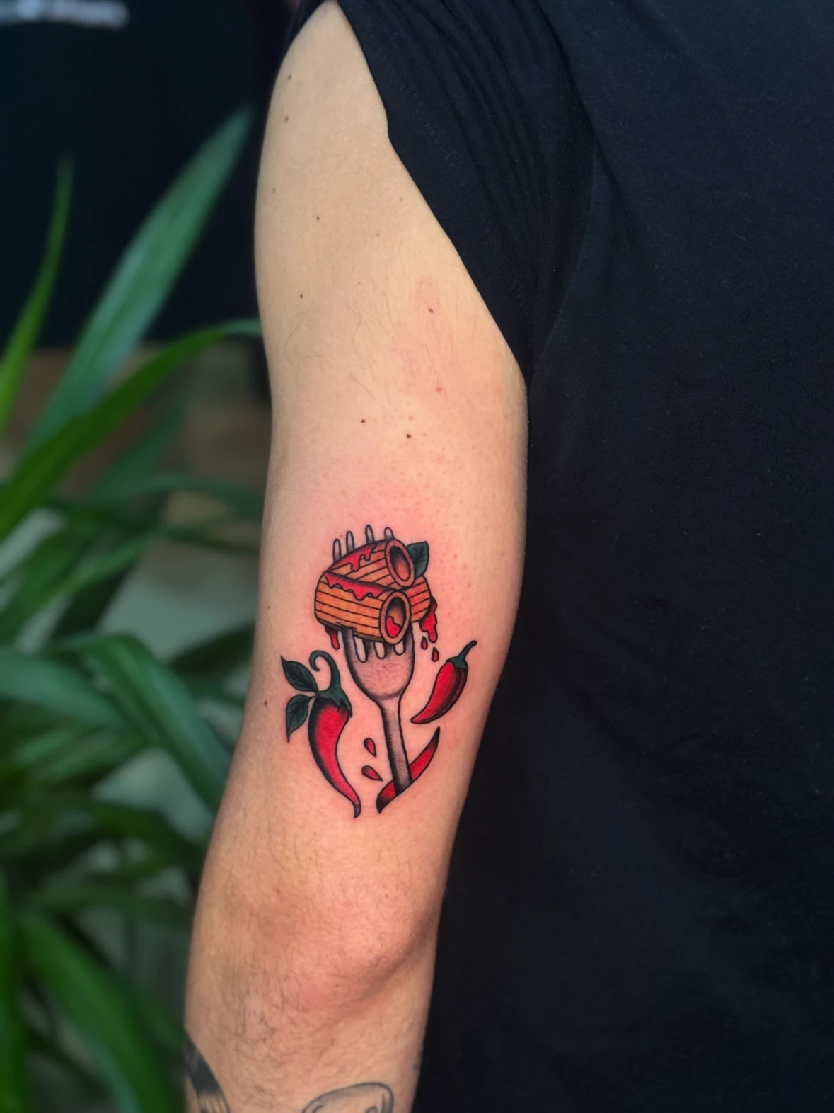
What defines an old school tattoo
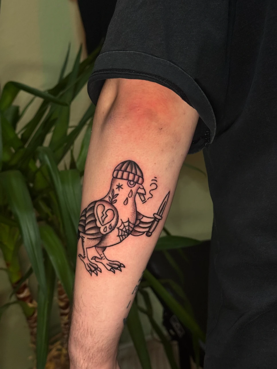
In tattooing, old school usually means American Traditional: a visual language built around prominent black outlines, deliberately placed shadows and a limited colour palette. Roses, daggers, hearts, eagles and other easily recognisable motifs are part of its familiar repertoire. Red, yellow, green and blue are common choices, although black and grey is also an option. [1]
The term “traditional” does need context, however. It can also refer to other tattoo traditions. This article focuses on Western old school design, particularly its American influences, rather than every form of traditional tattooing worldwide.
Seafaring and port cities are part of this history. The National Museum of the American Sailor documents how closely tattoos were connected to American sailors’ culture and how sailors helped spread tattooing through society. This is an important part of its development, but it does not explain the origins of all tattoos. [2]
Why we recognise clear motifs quickly
Imagine a small drawing of a swallow. If its wings, head and forked tail are easy to distinguish, you can already recognise the bird from its outline. Individual feathers can add to the drawing, but they do not have to do all the work.
This order of priorities helps when designing a tattoo: first the overall shape, then the main light and dark areas, and only then the details. If everything is meant to be equally important, the elements compete with one another. A clear central motif gives the eye a starting point. Here, “timeless” describes a quality of the design: the image makes sense without needing to know a current trend.
Three motifs show what matters
The following examples are hypothetical designs. They show how drawing decisions can change the result; they do not describe specific client projects.
Rose: the bloom needs a recognisable structure
You can always add more petals to a rose. The more useful question is which petals actually explain its shape. A clearly defined centre, a few larger outer petals and well-placed dark areas can already create a convincing bloom. When many narrow petals are packed into a tiny space, the individual shapes become harder to distinguish.
For a compact design, it is worth making a comparison: how does the rose look with fewer internal lines? Is the flower still recognisable when you view the drawing at its intended size? A simplified version can look more deliberate than a detailed drawing that has simply been shrunk.
Swallow: posture tells part of the story
With a bird, its movement matters as much as the motif itself. Wings raised steeply create a different sense of tension from wings spread wide. A slight turn in the body can make it feel more dynamic. It is worth choosing this posture before deciding on details in the plumage.
Placement matters too. A wide design can wrap around the sides of a narrow forearm, leaving only part of it visible from the front. That is not necessarily a problem, but it should become apparent when trying out the stencil. If seeing the whole bird from one angle matters to you, it needs a suitable area or a different wing position.
Heart with a banner: the text determines the space needed
A simple heart is relatively easy to scale down. Adding a banner with a name, date and long sentence changes the task. Now the letters, the spaces inside them and the folds of the banner also need to remain distinct. Instead of squeezing everything together, it often makes sense to choose shorter text, a larger size or a different arrangement.
Personal meaning does not require a fixed interpretation of the symbol. You can connect a familiar motif with your own memory or choose it simply because you like its design. A tattoo does not have to explain its meaning to everyone at first glance.
Black, colour and open skin play different roles
A black outline separates shapes. Larger dark areas give the image weight. Colour can direct attention to individual parts. Uninked skin brings light into the composition and separates neighbouring elements. These roles should work together in the design.
In a rose, the bloom might carry the strongest colour accent, supported by leaves and shadows. Adding other equally striking colours, lettering and a background changes the visual hierarchy. More elements are therefore not automatically an improvement. What matters is whether you can still tell where to look first.
Why good readability does not guarantee longevity
A motif can lose some contrast and still remain recognisable if its basic shape is clear. This is the understandable design advantage of a well-structured drawing. It does not establish a fixed lifespan or justify claiming that old school tattoos always age better than every other style.
Bold outlines do not make a tattoo immune to change. Nor can a thicker line compensate for a lack of space within the design. If a gap is barely visible in the drawing, there is little room for the edges to appear softer later. Instead of asking “How thick do the lines need to be?”, a more useful question is: “Are the important shapes clearly separated at this size?”
UV light also plays a role. The American Academy of Dermatology notes that it can cause some tattoo inks to fade. For healed tattooed skin exposed to the sun, it recommends a water-resistant, broad-spectrum sunscreen with an SPF of at least 30, reapplied regularly. [3] Fresh tattoos need the aftercare discussed for your individual situation; advice for healed skin does not replace it.
For more background, see the article on tattoo colours and longevity. When choosing a design, the aim is to plan for clear readability without promising an appearance that remains unchanged for decades.
Decide on size and placement together
A fixed minimum size in centimetres is only helpful to a point. A single heart has different requirements from a sailing ship with rigging. Even two roses of the same size can differ considerably in the number of internal lines. The smallest essential elements help determine how much space makes sense.
Look at the stencil at its actual size on the intended body area. Check it in a mirror and, where possible, from a little distance. An enlarged image on a screen reveals details that will barely be noticeable in everyday life. Let your arm hang naturally or change your posture too: how the design looks on your body matters as much as the drawing on paper.
A useful test is to ask what you recognise first from a normal viewing distance. Is it the rose, the bird or just a collection of dark patches? If the answer is unclear, fewer details, different spacing or a larger size may help. These are design options, rather than universal rules for every body and every motif.
A single motif can be the start of a collection
If you would like more tattoos later, it is worth considering the surrounding area. Which spaces would you like to keep free for larger motifs? Should the individual images stand on their own or sit close together? Your first small motif does not have to determine an entire arm, but it can affect later possibilities. For larger projects, planning a tattoo sleeve can help.
How to prepare your motif idea
You do not need a finished drawing to discuss a design. A small selection of references, with an explanation of what you like about each, is more useful than twenty almost identical images. These five points give the planning a direction:
- The main motif: What should be recognisable at first glance? What is simply an addition?
- The desired effect: Compact and calm, full of movement or deliberately bold? Describe the effect instead of only naming a style.
- Colour and the amount of black: Which colour accents do you like, and how dominant should dark areas be?
- Placement and size: Where should the tattoo sit? What size do you have in mind, and where are you flexible?
- Later additions: Is this likely to remain a single tattoo, or would you like to build up the surrounding area gradually?
Ask to see healed work too, where those photographs are available. Fresh photos show a different stage from a tattoo that has already healed. When viewing them, look at recognisable shapes, the distribution of dark areas and the separation of important details. A photograph alone cannot provide a complete assessment of the technical quality, however.
Frequently asked questions about old school tattoos
Does an old school tattoo have to be colourful?
No. Black and grey is also possible. Outlines, shadows, proportions and the structure of the motif contribute to its character too. Choosing whether to use colour should reflect the effect you want. [1]
Can small old school tattoos work?
They can work if the drawing suits the available space. A compact symbol allows different sizes from a motif with lettering and many overlapping shapes. A complex design should therefore not simply be scaled down proportionally.
Is every tattoo with bold lines automatically old school?
No. A bold outline is one individual feature. The rest of the design and its relationship to traditional imagery matter too. A modern illustration can draw on individual features without being a classic American Traditional tattoo.
Do old school tattoos always stay sharp?
No. No style guarantees unchanged outlines. A clear overall shape and sufficiently separated elements can support readability. That is different from promising that lines and colours will always look exactly as they did on the first day.
Discuss your old school motif in Munich
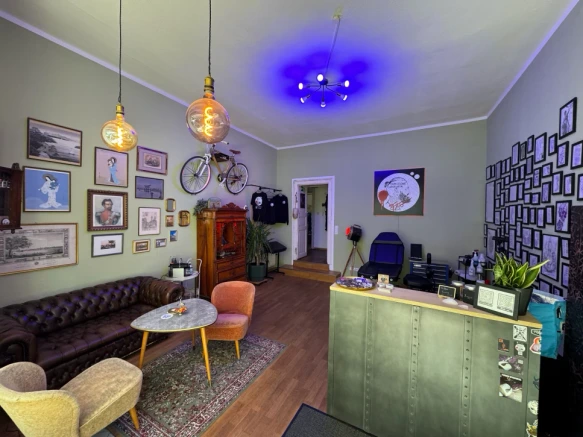
If you would like to discuss your idea at Tattooine Sayagata in Munich-Bogenhausen, send the main motif, your preferred placement and a few suitable references. The Old school & Traditional overview offers a starting point. Together, we can work out which design suits your ideas and the space available.