





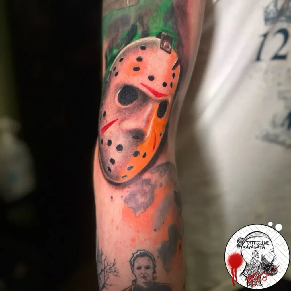
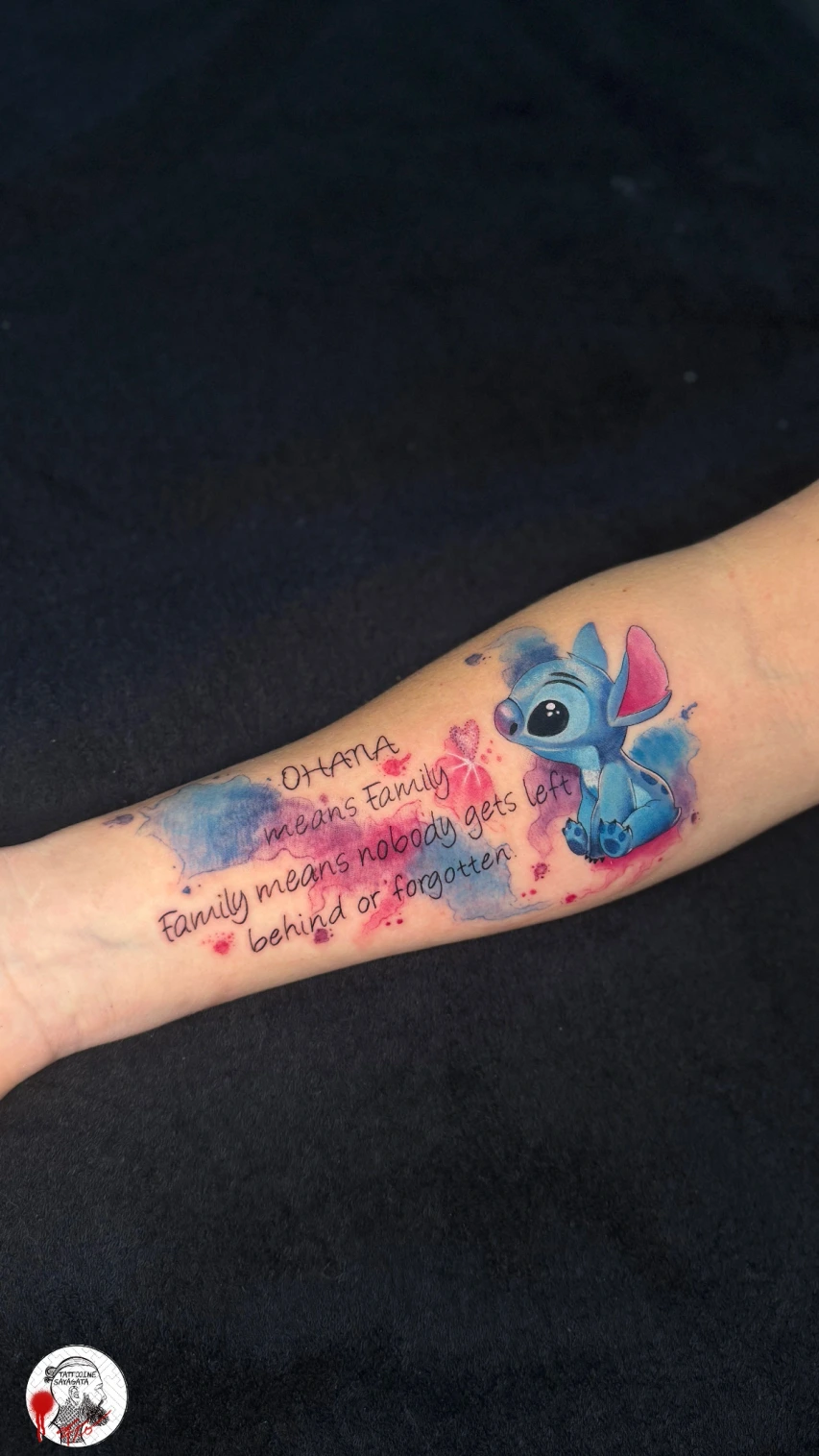
Longevity is not a color property. Longevity is planning.
Many questions about tattoo colors sound simple at first: Does black last better than color? Does red fade faster? Will light tones disappear after a few years? The honest answer is less convenient but more useful: a color does not stay visible only because it is black, red or blue. It stays visible when motif, contrast, size, body placement, skin type, technical execution and aftercare work together.
For your design, compare blackwork with strong black areas and black & grey with tonal gradations. The service pages show studio work and explain how contrast and open skin are used.
Every tattoo ages. Lines soften, skin changes, sun works over the years, and the motif is seen through the skin - not like a print on paper. That is why the most important question is not "Which color is strongest?" but "Which design stays readable in your skin long-term?"
In practice this means: a color tattoo can still look strong after years when it is built clearly. A black tattoo can become visually busy when too many details sit on too little space. Good longevity comes from good decisions before tattooing, not from maximum color.
Why tattoo color looks different in skin than on a screen
Tattoo color does not sit on top of the skin. It is placed into the skin and remains visible because pigments are stored in deeper skin layers. The motif is always seen through your own skin. Skin tone, undertone, blood circulation, tanning, scars, freckles and skin thickness all influence how strong a color looks in the end.
This is why a color from a reference does not automatically look the same on your body. A cool grey can look clear and soft on one person and flatter on another. Yellow can shine on light skin but have less contrast on more strongly pigmented skin. Red can be very present, but it still has to fit the motif structure and the condition of the skin.
What this means for motif planning
- Colors should not be planned in isolation.
- Light colors need size, surface and contrast.
- Small color accents need a clear surrounding structure.
- A motif has to work from normal distance, not only in phone zoom.
- The same color combination can behave differently depending on placement.
Good consultation therefore does not start with a color chart alone. It starts with the motif: what should be readable from a distance, what may remain subtle, and where does the tattoo need depth, calm areas or clear edges?
Black: strong and durable, but not automatically indestructible
Black is often the most stable visual foundation in tattooing because it creates the highest contrast to the skin. Clear black lines, solid areas and deliberate shadows give a motif structure. That is why many long-lasting styles use a strong black component: blackwork, traditional, Japanese, graphic motifs and high-contrast ornaments.
Still, black is not a magic trick. Black lines can also look softer with time. Fine details can visually merge if they are placed too close together. Large black areas can appear uneven depending on skin, healing and aftercare. A good black tattoo needs as much planning as a color tattoo.
Black holds especially well when:
- lines are not packed too tightly,
- solid areas fit the body placement,
- there is enough negative space,
- contrast is built deliberately,
- the tattoo is not exposed to UV light unprotected for years.
If you are planning a graphic, clear or large-scale motif, the page on blackwork tattoos in Munich shows how much longevity depends on rhythm, surface, spacing and clean structure.
Black & grey: longevity comes from values, not from "less color"
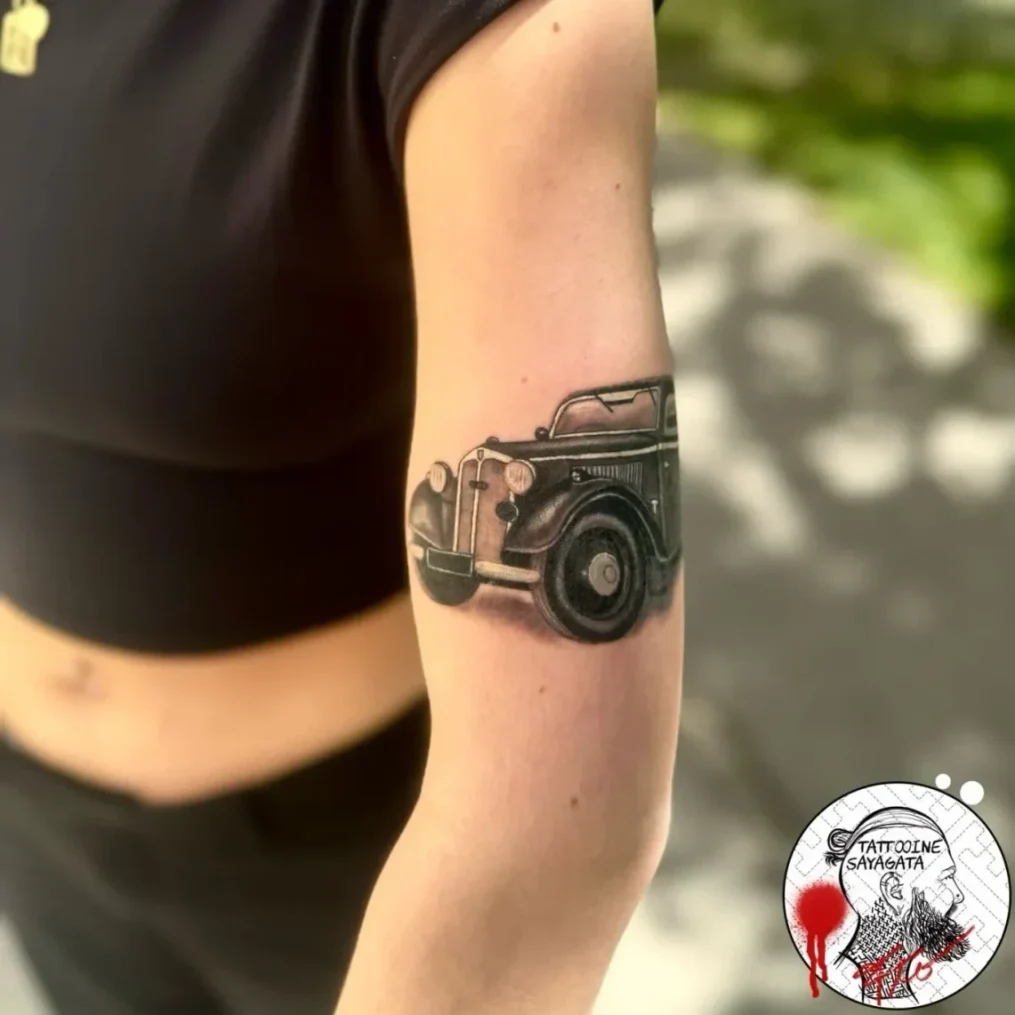
Black & grey is often perceived as softer, calmer or more realistic. The style works with values: black, dark grey, mid-grey, light transitions and open skin. Its long-term effect depends heavily on how clearly those values are separated.
If a motif consists only of very close grey transitions, it can look flatter after years. If it has dark anchor points, clear shadows and consciously placed light areas, it stays more readable. Black & grey is not automatically safer or more subtle. It is a style that needs good value control.
Important for black & grey:
- Dark areas give the motif depth.
- Too many soft details on a small area lose clarity faster.
- Skin as a light area must be planned deliberately.
- Portraits, animals, florals and realism need enough size.
- After full healing, UV protection strongly affects the long-term result.
You can find more on the style page for black and grey tattoos in Munich. The style is strongest when it is not only soft, but also readable from a distance.
Color tattoos: strong when color does not have to work alone
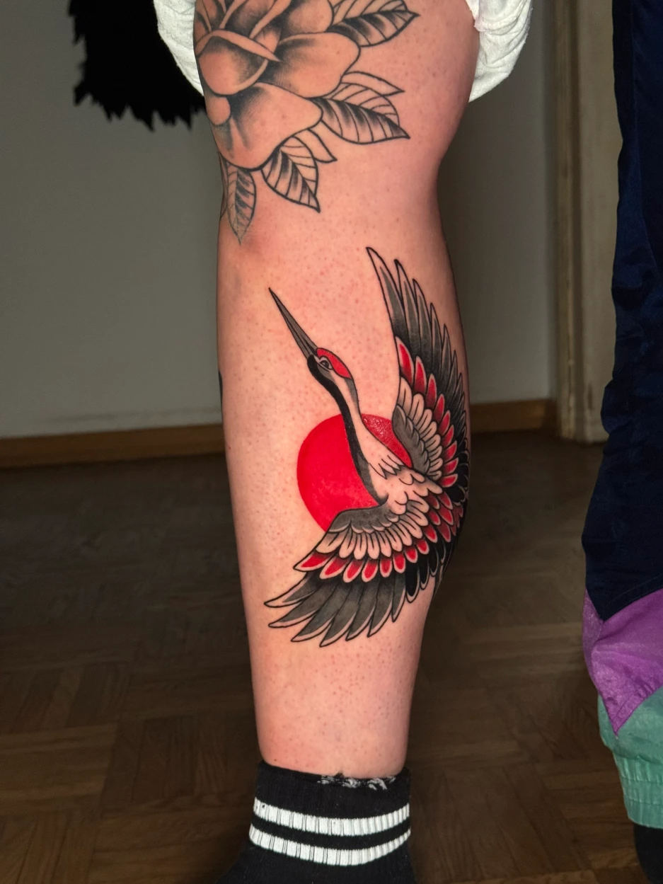
Color tattoos can look very strong over time when they are constructed well. This is especially visible in traditional motifs, Japanese tattoos and clear illustrative work: color rarely works alone. It is carried by outline, shadow, composition and enough surface.
Color becomes difficult when it is too light, too small, too isolated or used without enough contrast. A tiny pastel yellow accent on sun-exposed skin has a different long-term outlook than a solid red area with a clear black structure. The question is not "Is color bad?" but "Does this color have enough support in this motif?"
Typical color logic in practice
- Red and orange: often clearly visible, but worth discussing carefully with sensitive skin or known reactions.
- Yellow and light tones: can look brilliant, but need surface and contrast.
- Blue and green: can be strong, depending on motif structure, undertone and aftercare.
- White: works better as an accent or highlight than as a reliable main color.
- Pastel: needs especially realistic expectations and planning.
A color tattoo should not be planned like a sticker. Good color needs hierarchy: what is the main shape, what is shadow, what is accent, and which color may age without weakening the whole motif?
Skin type, body placement and everyday life: color does not look the same everywhere
A tattoo on the forearm ages differently than a tattoo on the ribs. Hands, fingers, feet, elbows, knees and highly mobile areas are under more stress. Areas that get a lot of sun change differently than body parts that are usually covered. Skin is also not equally thick, smooth or calm everywhere.
Skin type also influences color effect. This is not about better or worse, but about contrast. Dark lines on light skin create a different effect than light color accents on warmer or more pigmented undertones. Good planning takes that seriously without turning it into rigid rules.
Placement is especially important for:
- very small motifs with fine lines,
- light colors and pastel tones,
- motifs without a black outline,
- realistic motifs with many soft transitions,
- tattoos on hands, fingers, feet, knees or elbows,
- visible areas with frequent sun exposure.
For fine motifs, the article on linework and fineline tattoos in Munich is a useful addition. It focuses more on technique, motif choice and line longevity; this article explains how color and contrast influence those decisions.
UV light: the biggest enemy of long-term color effect
When a tattoo looks faded long-term, the color itself is not always the only reason. Sun is a central factor. UV light stresses the skin and can make tattoo pigments look faded. This does not only affect color tattoos. Black can also become softer and greyer when the skin regularly gets unprotected sun or solarium exposure.
During healing, direct sun on a fresh tattoo is not an option. Sunscreen is not a replacement for shade and loose clothing in this phase. Once the skin is fully healed, sun protection becomes one of the most important tools for keeping contrast and color clear.
Long-term care for strong tattoos
- Use sun protection consistently after full healing.
- Avoid solarium and unnecessary UV exposure.
- Keep the skin normally cared for and not overly dry.
- Do not swim, scratch or soak a fresh tattoo.
- Unusual redness or healing reactions should be clarified medically.
For the healing phase, read proper tattoo aftercare. It explains cleaning, cream, scabbing, sport, sun and swimming during the first weeks.
Motif size and contrast: why "more detail" is not automatically better
Many people bring very detailed references. They look strong on a screen because you can zoom in. On skin, a tattoo has to work without zoom: in everyday life, in motion, from normal distance and years later. Long-term durability is often less a color question than a readability question.
A motif with many tiny colored details can look impressive fresh, but become busy faster if the details sit too tightly. A reduced motif with clear form, clean contrast and enough negative space can age stronger even if it looks less dramatic at first glance.
A long-lasting design pays attention to:
- enough size for the desired amount of detail,
- a clear main shape instead of equal micro-details,
- enough spacing between lines, dots and color areas,
- deliberate dark anchor points,
- skin as negative space,
- a body placement that fits the motif.
This is especially true for patterns, ornaments and geometric motifs. With geometric tattoos, dotwork and mandala tattoos or Sayagata tattoos, precision decides the effect. Too much detail in too little space affects the first-day look and the later readability.
Tattoo inks, EU rules and safety: what you should know realistically
Tattoo ink is not a normal cosmetic product that only sits on the skin. It is inserted into the skin. Origin, composition, hygiene and professional application matter. Since 2022, EU REACH restrictions apply to certain substances in tattoo and permanent make-up inks. This means many problematic substances are banned or limited to defined thresholds.
Regulation does not mean that every color is guaranteed to be unproblematic for every person. Serious studios do not promise "zero risk". They work with traceable materials, hygienic processes and honest consultation.
For a closer look at what REACH regulates, why Pigment Blue 15:3 and Pigment Green 7 are affected, and why color tattoos remain legal, read our guide to the EU tattoo ink restrictions.
For you as a client, this matters:
- Tell the studio about known allergies or previous reactions.
- Do not tattoo irritated, injured or sunburned skin.
- Ask questions if you are unsure about a color.
- Plan color motifs according to skin, style and long-term effect.
- Unusual skin reactions after tattooing should be checked medically.
Useful background information is available from the BfR on tattoo inks, the European Chemicals Agency and the American Academy of Dermatology on caring for tattooed skin.
Touch-ups or refreshes: when color can become stronger again
Not every change is a mistake. Tattoos live in skin, and skin changes. Still, there are situations where a touch-up or refresh can make sense: small light spots after healing, uneven areas, weakened color accents or an older tattoo that should become part of a larger concept.
Timing matters. Right after initial healing, the skin is often not ready for a reliable assessment. Many tattoos look different in the first weeks than after full settling. Working too early can stress the skin unnecessarily. A calm assessment after full healing is better.
Touch-up, refresh or cover-up?
- Touch-up: a small correction after healing if individual areas did not settle evenly.
- Refresh: deliberate reworking of an older tattoo to strengthen contrast, lines or color.
- Cover-up or extension: a new concept when an old tattoo should be changed, not only refreshed.
With older color tattoos, "more color" is not always the best solution. Sometimes a stronger outline, darker background or expanded motif helps more than simply refilling faded areas. For unwanted or heavily changed tattoos, a cover-up in Munich can be the better option.
FAQ: tattoo colors and longevity
Which tattoo color lasts the longest?
Very dark tones and clear black outlines usually stay most readable because they create strong contrast. Pigments matter, but so do motif size, placement, skin type, UV protection, healing and technical execution.
Do color tattoos fade faster than black tattoos?
Color tattoos can lose brightness faster, especially with light tones, frequent sun exposure or too little contrast. Well-planned color tattoos with clear structure, suitable size and consistent aftercare can still look strong for a long time.
Why can black look greyer over time?
Black is seen through skin layers and changes visually with skin aging, UV light, pigment distribution and natural line softening. The tattoo does not simply disappear, but it can look softer over the years.
Is white tattoo ink durable?
White is difficult as a main color. It can work as a highlight, but often becomes more subtle, can shift visually and is not ideal for every motif or skin type.
Can a faded tattoo be made stronger again?
Often yes, but not always by simply adding the same color. Sometimes the tattoo needs more contrast, new lines, shadows, background or an extension. Whether touch-up, refresh or cover-up makes sense depends on the tattoo's condition.
The best tattoo color is the one that fits the motif long-term
Black, grey and color all have their place. The question is not which option is generally better. The question is which color decision fits the motif, skin, body placement, size and everyday life. A strong tattoo is not only impressive on the day it is done; it remains readable over the years.
If you want color, do not treat color as a simple effect. It needs structure, contrast and enough room. If you want black, do not misunderstand black as a guarantee. Dark tattoos also need spacing, aftercare and good placement. If you want to wear a motif long-term, ask whether the idea will still work when the first fresh shine is gone.
Planning tattoo colors realistically?
Bring your motif idea - we can discuss which colors, contrasts and sizes make sense long-term.
Tattoo aftercare: what matters after tattooing
Cleaning, cream, scabbing, sport, sun and swimming: this guide explains the most important healing phase points.
Read article
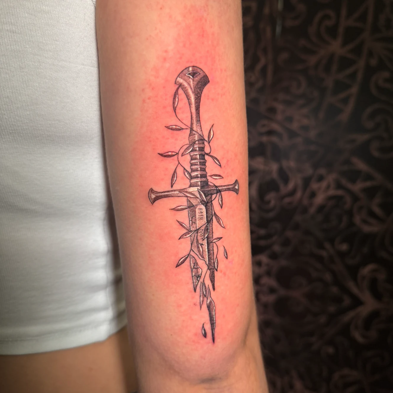
Linework and fineline tattoos in Munich
Fine lines need realistic motif choices, enough spacing and placement decisions that fit long-term readability.
Read article
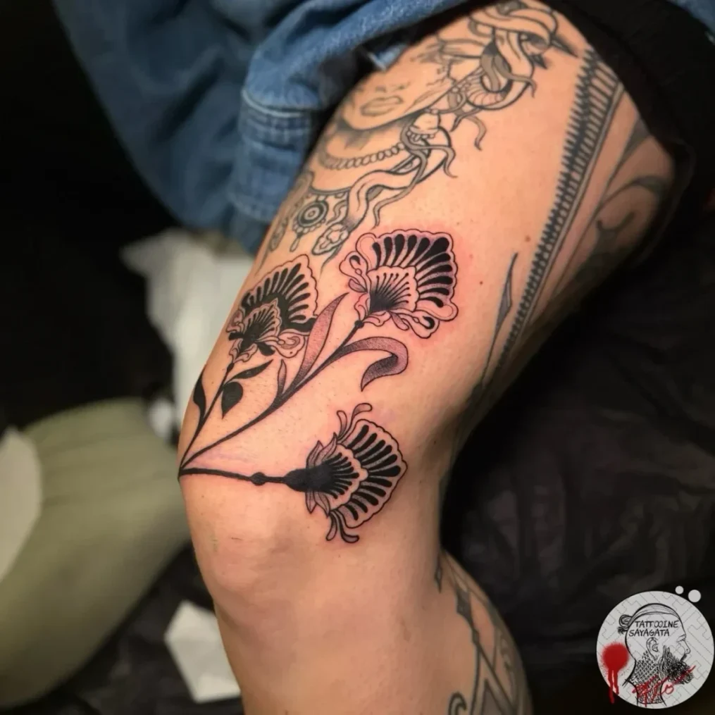
Tattoo pain: which areas hurt more?
Body placement affects pain, healing and everyday wear. This article gives a realistic studio-based overview.
Read article