


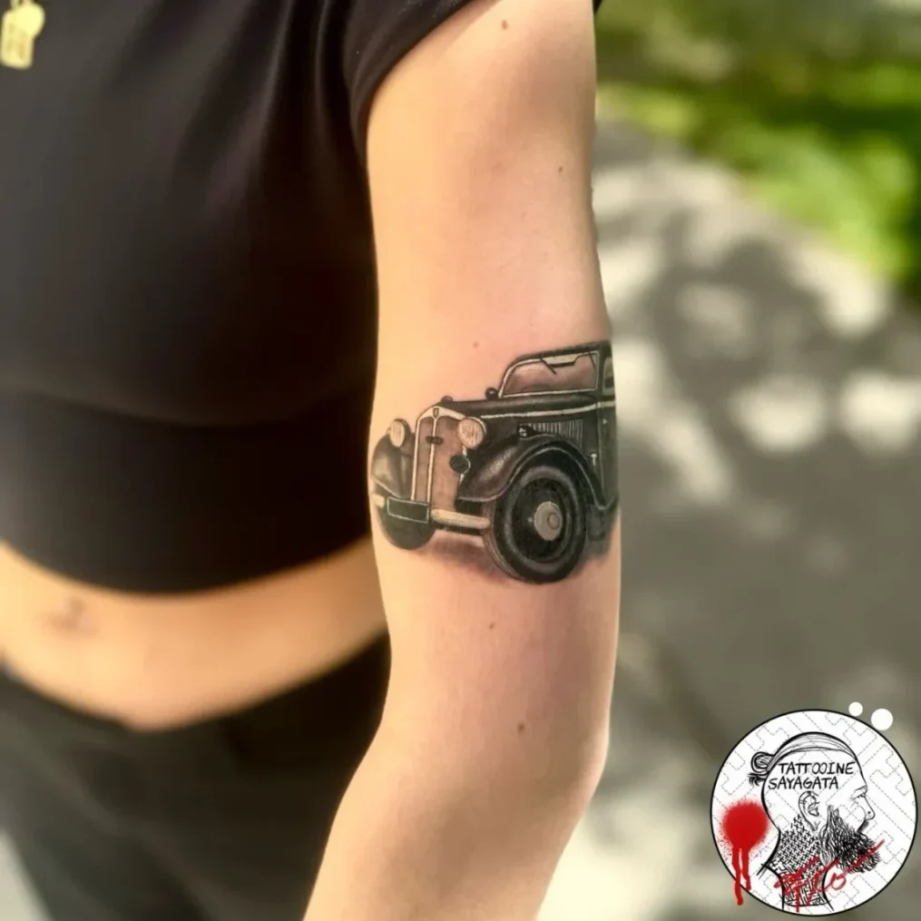
What is the difference between blackwork and black & grey?
Blackwork: shapes, textures and open skin
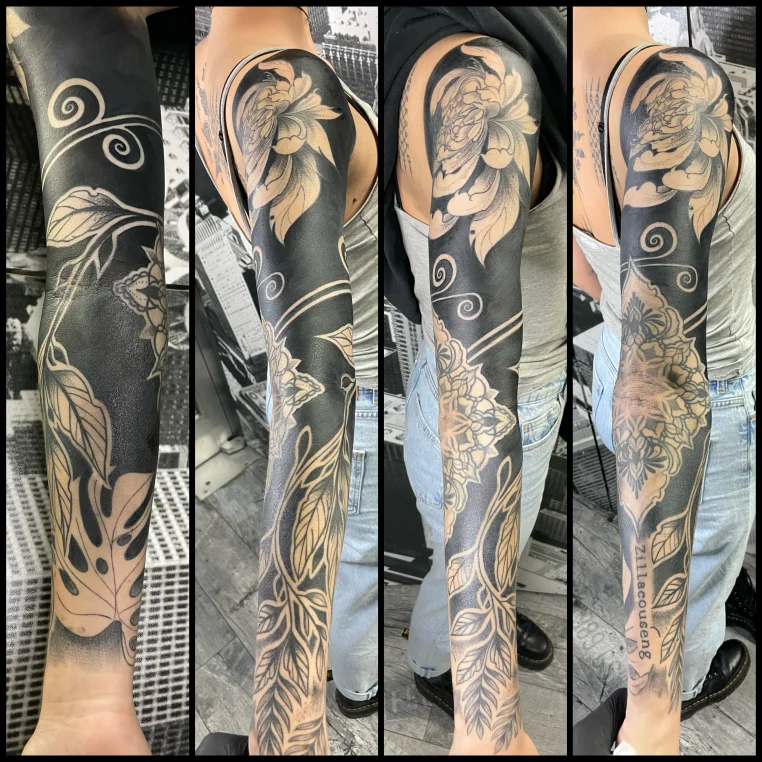
Blackwork focuses on black lines and solid areas and their contrast with uninked skin. It can be ornamental, geometric or figurative. Alongside solid black areas, it can also use hatching and dots: varying their density creates a lighter or darker appearance without having to render every tonal change as a smooth grey gradient.
Blackwork does not automatically mean an entirely black arm. An area tattooed almost completely solid black is called blackout. In many blackwork designs, however, the shapes left uninked are precisely what define their character.
Black & grey: creating form through tonal gradation
Black & grey uses black, shades of grey and open skin to create light, shadow and volume. It often uses greywash: black tattoo ink diluted to different strengths, also available as ready-made mixtures. A lighter appearance therefore does not necessarily come from adding white ink.
Black & grey does not have to be photorealistic or particularly light. Illustrations and Japanese-inspired motifs can also use this approach. These terms are not rigid categories; individual pieces can combine both approaches.
Blackwork and black & grey compared
On narrow screens, you can scroll the table sideways.
| Feature | Blackwork | Black & grey |
|---|---|---|
| Visual effect | Graphic shapes and clear boundaries between light and dark | Tonal gradation, shadows and a sense of depth |
| Design elements | Lines, solid black areas, dots or hatching | Dark accents, grey tones and soft or hard transitions |
| Open skin | Often forms patterns or motifs in its own right | Can create highlights and separate shapes |
| Typical strengths | Silhouettes, ornaments and graphic animal and plant motifs | Volume, surfaces, portraits, animals and figurative motifs |
| Planning pitfall | Light gaps between dark shapes that are too narrow | Grey values that are too similar where areas need to remain distinct |
This comparison describes the main emphasis of each approach. A blackwork tattoo can be delicate; a black-and-grey tattoo can contain large, bold areas of black. What matters is which elements carry the design.
The same motif, two different designs
The following examples illustrate possible approaches. They do not describe specific client projects.
A peony: the shape of the flower or the volume of its petals?
In a graphic peony, solid black leaves could frame a light flower. Individual lines would define the petals. In black & grey, shadows between the petals could show which curve towards you and which sit behind them. Ask yourself: is it the flower’s striking shape that you like in your reference, or the soft interplay of light and shadow?
A raven: silhouette or plumage?
A blackwork raven could remain recognisable through its beak, posture and groups of feathers left uninked. A black-and-grey version could model the chest, wings and head using different tonal values. If the bird is to be small, both versions would require a decision about which feather details can be omitted.
An ornament: a pattern or a three-dimensional object?
A repeating pattern can be read through dark shapes and light gaps. If the ornament is meant to resemble a sculpted relief, shadows could support that idea. Adding more shading does not make it better in itself: shading is useful when a sense of depth is part of the intended motif.
How size and placement change your choice of style
A design on a screen has no fixed size. On your body, it does. Before focusing on tiny feathers, leaf veins or skin pores, establish which features are essential. For an animal portrait, these might be the position of the eyes, the shape of the head and distinctive markings in the fur. A decorative twig might only need the right arrangement of leaves.
Compare two sizes, not just two styles
Ask to see the intended effect at your planned size and in a slightly larger version. Look at both from a normal viewing distance. What is lost in the smaller version? If the defining feature disappears, the design needs more space or fewer secondary motifs.
There is no universal minimum size for blackwork or black & grey. A simple symbol has different requirements from a face with soft tonal transitions. Even a seemingly simple black pattern can be too tightly packed if its light gaps have barely any room.
Decide on the main viewing angle
Think about how you want the tattoo to be seen in everyday life: on the outside of the forearm, with your arm hanging naturally, or from the front of your thigh. A design can look coherent in a photograph but lose important parts from view when you rotate your arm. That calls for a different decision with a face than with a pattern deliberately wrapping around the arm.
Check the placement in motion too. Distortion may be more noticeable in a geometric border at the elbow than in a loosely drawn leafy branch. Placement does not dictate the style, but it changes how the design is carried out.
Open skin is part of the motif
Uninked areas are known as negative space. They can form a light outline, keep two dark leaves apart or provide a highlight along the edge of a face. This matters in both styles.
One useful question for your design is: which light areas need to remain so that I can recognise the motif? On a black bird, it might be the gap between the wing and body. On a shaded flower, it might be the separation between neighbouring petals.
Judge these areas on your skin, not only on white paper. Your skin tone is part of the visible balance between light and dark. Healed work on a similar skin tone can help you assess this; the style label alone tells you little about it.
Which style stays readable for longer?
A reliable ranking along the lines of “blackwork always lasts longer” cannot be established for an individual tattoo from its style alone. It also matters what needs to remain: the overall silhouette, a fine pattern or the expression on a face.
In a graphic motif, a clear outer shape can make it recognisable. If the inside consists of very narrow light slits, however, it still requires care. In black & grey, well-separated light, mid-tone and dark areas can support the form. A motif whose important details are separated only by minimal differences in tone requires particularly careful planning.
How to assess a portfolio
- Look at healed work: It shows how lines, solid areas and transitions actually look after healing. Ask for older photographs of the same tattoo too, if available.
- Look at the whole body area: A close-up shows detail. A wider view shows whether the size and placement work.
- Find comparable pieces: A successful large portrait does not automatically tell you how a small ornament will be handled.
- Consider lighting and editing: Strong contrast, filters or very dark photographs can make it harder to assess grey tones.
Sun protection also deserves attention after healing. UV light can fade tattoo inks. The American Academy of Dermatology recommends a water-resistant, broad-spectrum sunscreen with SPF 30 or higher for tattooed skin in the sun. A fresh tattoo needs the studio’s separate aftercare instructions; sunscreen is not a substitute for wound care.
You can read more about the individual factors in Tattoo colours and longevity.
Combining blackwork and black & grey
A combination can work when each approach has a clear role. One possibility would be a softly shaded animal head within a graphic frame. The frame should then draw attention to the head and leave enough space around its important outlines.
Start by assessing the combination as a rough light-and-dark sketch: does your eye go to the intended main motif? Does it still make sense before you can even see the details? Only then is it worth considering fur texture, fine lines or additional patterns.
If you want to extend the tattoo later, planning the whole sleeve early helps. It allows you to think ahead about connections and open areas for future motifs.
When you already have a tattoo
For an extension or a cover-up, the choice of style starts with what is already there. Mark three things on a photograph: what should remain visible, what can change and which skin should remain uninked. These wishes may limit one another.
Where dark pigment already sits, uninked skin is no longer available to create a highlight. Light greywash cannot simply make an existing dark tattoo disappear. Adding more black does not solve every problem either: it changes the overall distribution of light and dark.
A cover-up therefore needs a design for that particular existing tattoo. Placing an arbitrary blackwork reference over it is not enough. The article Cover-up tattoo in Munich explains the possibilities and limitations in more detail.
Five questions to help you choose your style
- What do you like about the reference? Name a visible feature: the clear outline, the light on a face, the overall dark appearance or the texture of a surface.
- What needs to remain recognisable? Decide which two or three details must stay. Everything else can be weighed against size and readability.
- How prominent do you want the tattoo to be? Compare the distribution of dark areas and open skin. A large, densely shaded black-and-grey motif can look more striking than a small, graphic blackwork design.
- How much space do you actually want to use? Give an approximate size and show the entire body area. “Not too big” leaves it unclear whether there is room for the level of detail you want.
- Do you want to add anything later? A frame, a dark boundary or an open area affects how further motifs can connect.
A brief a tattoo artist can work with
Instead of “I want a raven in blackwork”, you could write: “I want a raven on the outside of my forearm. Its posture and wing shape matter to me; individual feathers matter less. I want some skin to remain visible, and I would like to add plants later.”
This makes it possible to assess whether a graphic approach, a shaded version or a combination best matches your idea. Two or three references with brief notes are more helpful than a large collection without a clear direction.
Frequently asked questions about blackwork and black & grey
Can blackwork include shading?
Yes. Dots, hatching and structures of varying density can create tonal gradations. Depending on the artist’s approach, greywash elements may also be added. These terms are not used equally narrowly everywhere. Show specific references for the effect you want.
Is black & grey always realistic?
No. Drawn, stylised or ornamentally enhanced motifs can also use black and grey tones. Realism describes how closely the image aims to resemble its subject; black & grey mainly describes the use of black and grey tonal values.
Is blackwork more painful?
You cannot reliably tell from the style name. Placement, the area being worked on, session length, technique and individual sensitivity all play a part. When planning appointments, an assessment of the actual design is more useful than a general pain scale for different styles.
Is blackwork cheaper because it only uses black?
Not automatically. A complex pattern, precise edges or larger areas can require a lot of working time. With black & grey, factors such as the level of detail and shading affect the work involved. Compare quotes for the actual project. Read more: How much does a tattoo cost in Munich?
Can I make a blackwork tattoo lighter later?
Adding more tattooing does not restore uninked skin. A solid black area cannot simply be reworked into a light greywash gradient. If you want a lighter overall appearance, that wish belongs in the planning before the tattoo is done. For an existing tattoo, the possibilities for reworking it need to be assessed individually.
Discuss your motif at Tattooine Sayagata in Munich
You do not need to settle on a style name before getting in touch. Send your motif idea, preferred placement, an approximate size and a few suitable references. Describe what you like about the images and how much open skin you would like.
The pages on Blackwork tattoos and Black & grey tattoos show work from the studio. These examples can help you discuss with Flo which approach suits your motif and the available space.
Tattoo knowledge / Design planning
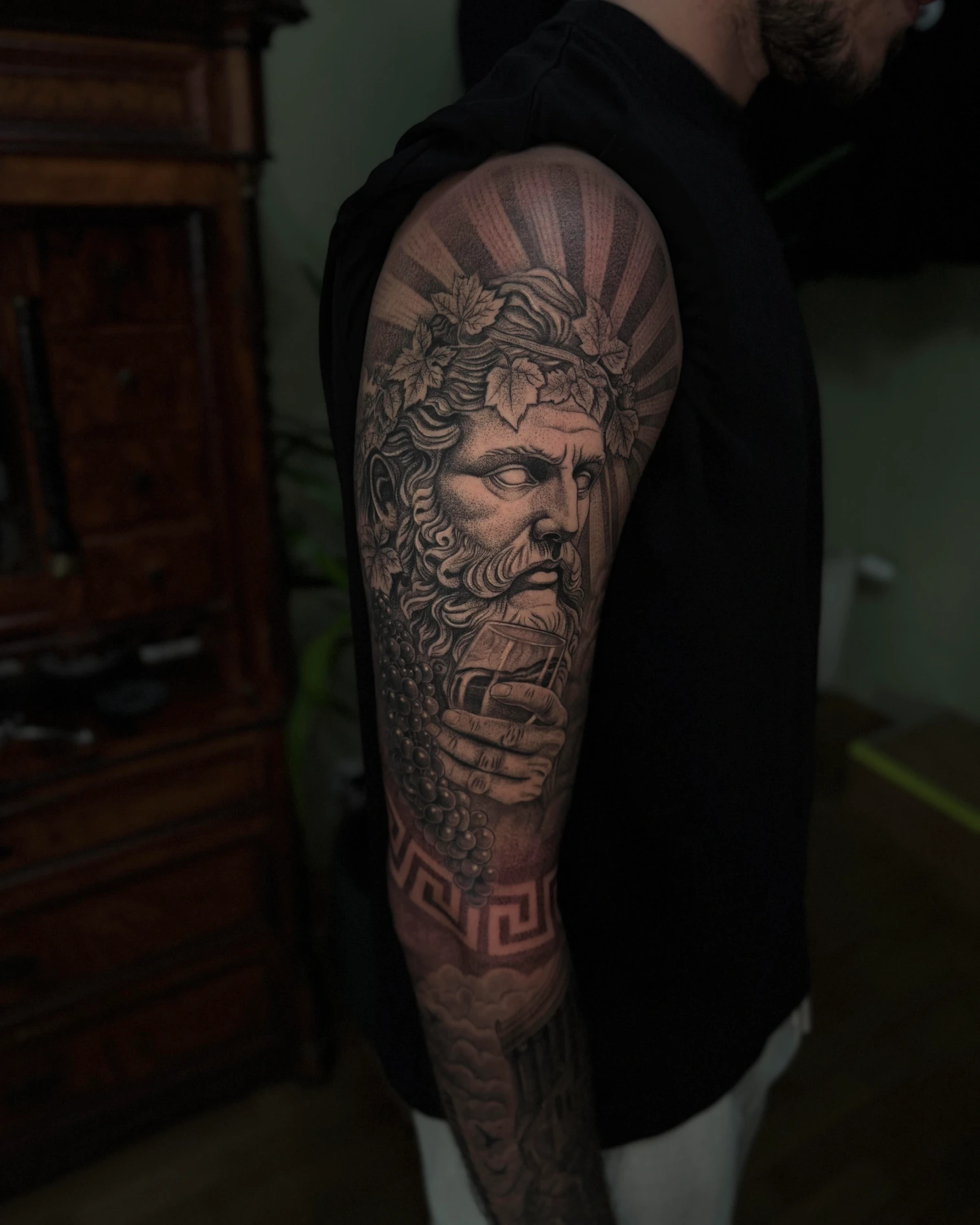
Planning a tattoo sleeve: from a single motif to a coherent composition
From the first motif to a whole arm: learn how to integrate existing tattoos, plan transitions and coordinate your style, budget and sessions.
Read article
Color & longevity
Tattoo colors and longevity - what matters for black, grey and color
Black, grey and color age differently in the skin. This guide explains how contrast, skin type, UV light, motif size and aftercare decide whether a tattoo stays readable long-term.
Read article
Cover-Ups & Tattoo Renewal
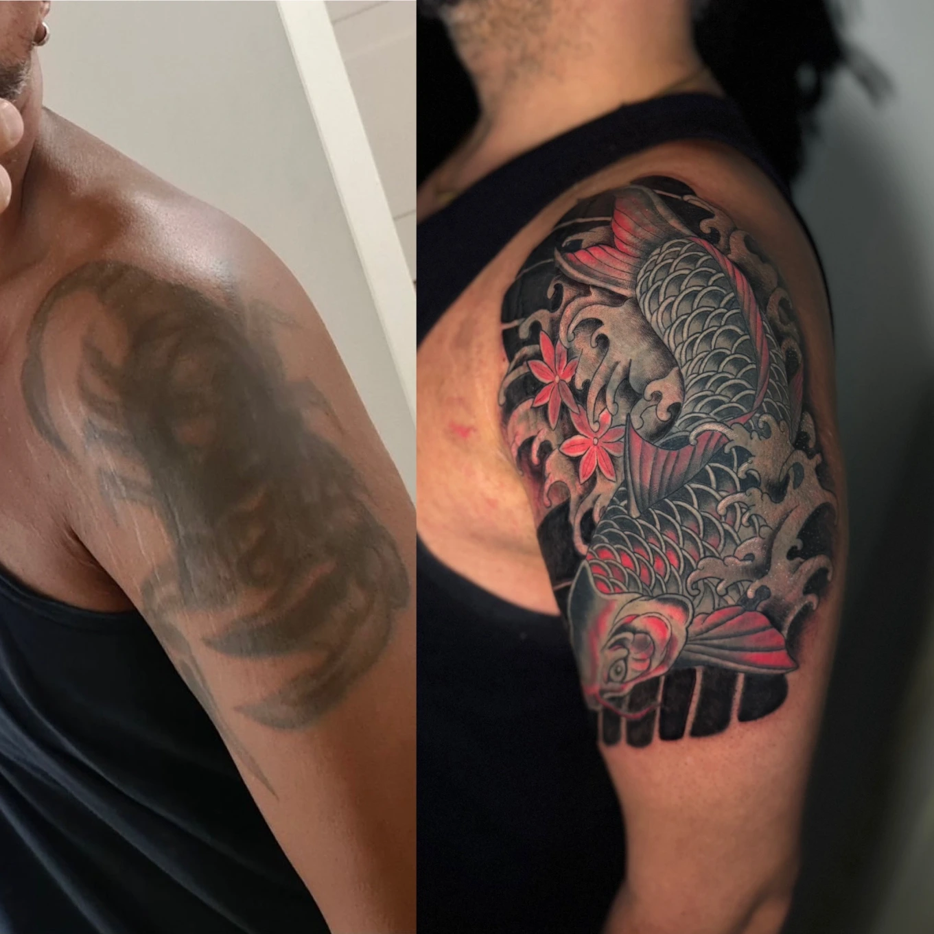
Cover-Up Tattoo in Munich: When Covering Works – and When It Does Not
When cover-ups work and how size, color, black density, design structure and skin condition set their limits.
Read article