What "Japanese tattoo" means professionally
Irezumi, Horimono and modern studio work
Historically, the terms Horimono (tattooing) and Irezumi (inserting ink) are commonly used in Japan. In Western studio practice, "Japanese tattoo" is mostly used as a stylistic term: large scale, clearly composed motifs with background elements and a characteristic spatial logic.
Important: A Japanese tattoo is not automatically "traditional" just because it shows a koi or dragon. Tradition develops through composition, line logic, background structure, color concept and the way the motif "wraps" around the body.
Fundamentals instead of cliches
Japanese motifs are often reduced to individual symbols ("koi = luck", "dragon = strength"). In practice, this falls short. Many motifs are part of a larger visual system in which seasons, elements, movement and contrasts interact. A good Japanese tattoo therefore works first and foremost as a composition - meaning is secondary and results from motif combinations, context and placement.
Structure of Japanese tattoos: Composition, areas and readability
The body is not a flat canvas
Japanese tattoos are traditionally designed on a large scale, because only large areas can properly support the composition. When creating the design, anatomy is actively considered:
- Axes of movement (shoulder, elbow, hip, knee) are planned as transitions
- Motifs are guided along muscle lines, not placed "straight" on top
- Negative space is used deliberately to maintain readability
Especially with sleeves, backs and chest panels, the overall shape determines the impact - not the amount of detail.
Main motif, secondary elements, background
A classic composition works on three levels:
- Main motif (e.g. koi, dragon, mask, samurai)
- Supporting motifs (e.g. cherry blossoms, maple leaves, peonies, waves, clouds)
- Background structure (Gako / "flow"): wind bars, wave fields, cloud formations, shadow areas
The background is not decoration. It connects areas, controls visual flow and ensures that the tattoo appears as a unified whole.
Line work: why it is evaluated differently in the Japanese style
Japanese tattoos require clear hierarchies:
- strong outlines for main forms
- secondary lines for textures (scales, fur, fabric folds)
- shading for shaping form, not as a "soft effect"
In studio practice, this is reflected in a simple rule: If the motif is not readable from 1 to 2 meters away, the hierarchy of line, area and contrast is usually not working correctly.
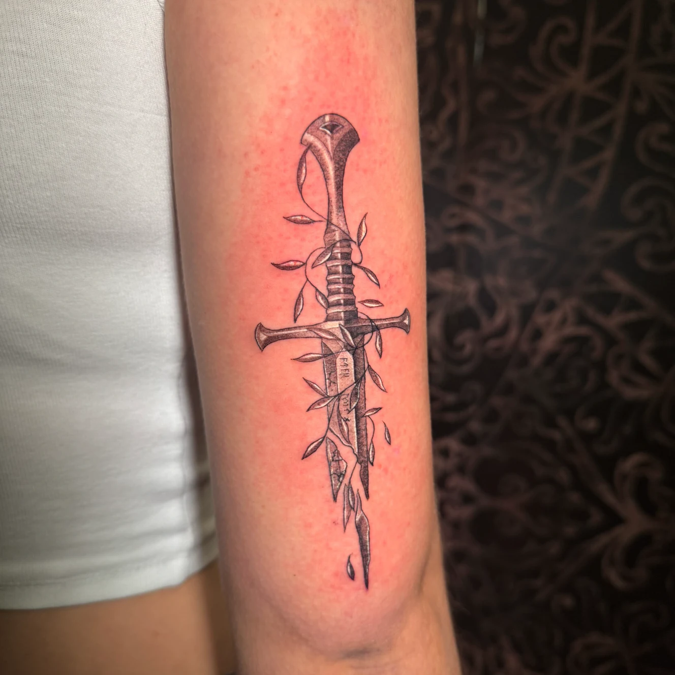
Typical motifs: koi, dragon, cherry blossoms, masks and samurai
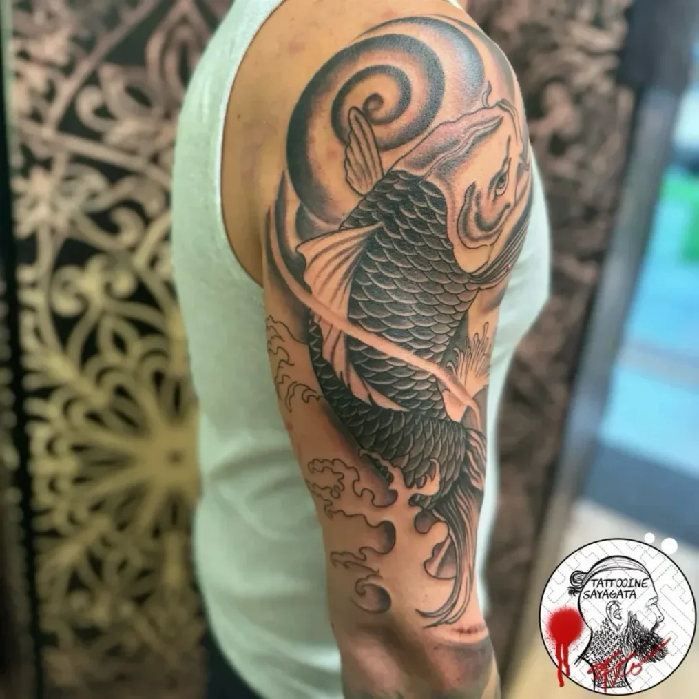
Koi tattoo: movement, direction, placement
A koi tattoo is defined by movement and flow. What matters less are "lists of meanings" and more technical decisions:
- Direction (upwards/downwards) influences the dynamics on the body
- Scale structure must match the size (too small quickly appears restless)
- Water areas are not background, but part of the movement
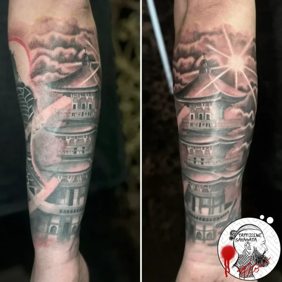
Koi work particularly well on the forearm, upper arm, calf and as part of a sleeve, because the flow direction can be guided cleanly there.
Dragon: volume, body guidance and space
Japanese dragons are demanding in design because they must appear elongated yet three dimensional. Crucial factors:
- Body guidance along shoulder/chest/back creates tension
- Head and hands are focal points, the body is the "line" that connects everything
- Clouds/wind bars are placed so transitions do not appear "cut off"
A dragon on too small an area usually loses impact because the motif needs volume in order not to appear graphically flat.
Cherry blossoms and seasonal elements: function in composition
Cherry blossoms, maple leaves or peonies are common in Japanese tattoos. Professionally, they fulfill two tasks:
- Rhythm: repetitions guide the eye through the motif
- Seasonal reference: motifs are often combined seasonally so the image remains coherent
However, too many small elements can disrupt the main form. That is why they are used in planning like "timekeepers", not as filler material.
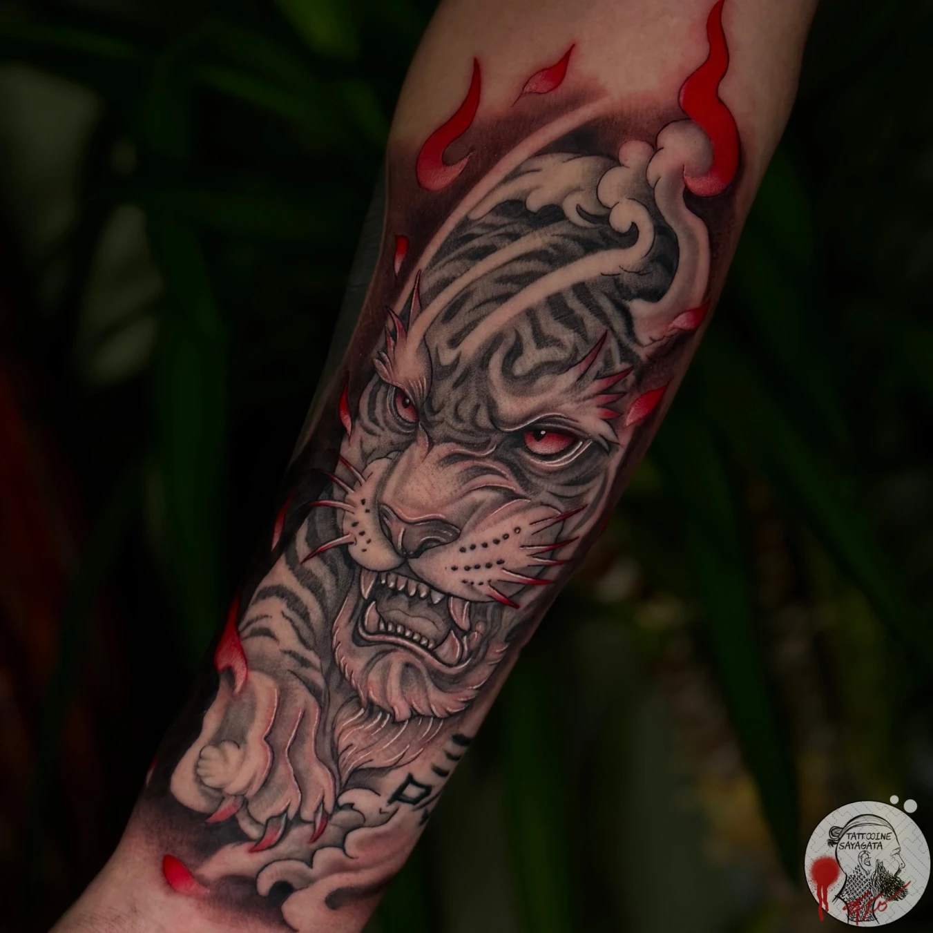
Masks: expression without portrait logic
Japanese masks (e.g. Hannya) are often understood as a "face", but stylistically they differ from portraits. Important aspects are:
- clear edges and contrasts
- a controlled color palette (too many tones make the mask appear restless)
- enough space around the mask so it does not appear "squeezed"
Masks work well as a focal point in sleeves or as a chest/shoulder element because they are read frontally.
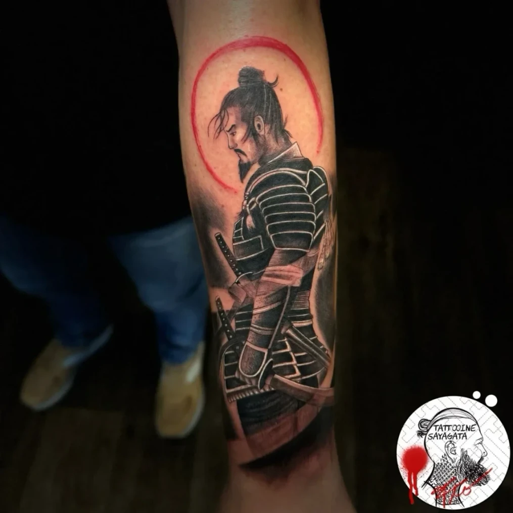
Samurai tattoo: motif choice and compositional risks
A samurai tattoo is complex because armor, fabric, weapons and posture create many details. For a clean execution:
- Samurai need sufficient space, otherwise the motif becomes too fragmented
- Pose and viewing direction must match the body area (e.g. shoulder/chest rotation)
- Background elements should support movement, not compete
Anyone in Munich specifically searching for samurai tattoo Munich should above all clarify whether the planned size does justice to the motif. A small samurai often appears like "too much information in too little space".
Traditional Japanese vs. Neo-Japanese: clear differences
Traditional Japanese: rules, reduction, contrast
In the tattoo context, "Traditional Japanese" often refers to an approach that follows classical principles:
- strong line hierarchy
- defined areas and contrasts
- clear background structure with recurring patterns
- colors applied deliberately rather than painterly
The result appears calmer, more graphic and highly readable in the long term.
Neo-Japanese: more freedom, more depth, more hybrid forms
"Neo-Japanese" adopts motifs and compositional logic, but expands the means:
- softer transitions, more color gradients
- additional textures and higher detail levels
- sometimes stronger influences from illustration, realism or graphic styles
The crucial boundary: if composition and background logic are lost, what remains is a Japanese motif, but no longer the Japanese style.
What is decided during consultation
In practice, "Traditional or Neo" is not chosen as a label, instead concrete parameters are discussed:
- line weight and contrast level
- color palette (reduced vs. extended)
- background: classically structured vs. freer atmospheric approach
- level of detail in clothing, scales, hair, waves
This makes the style controllable without clinging to buzzwords.
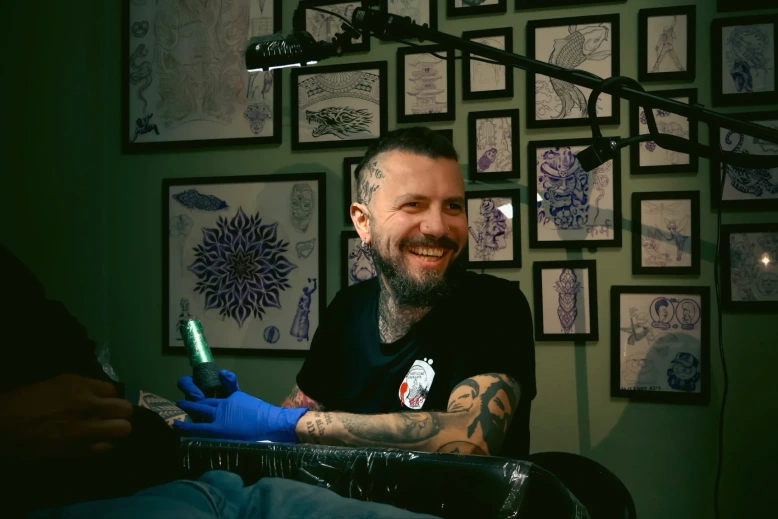
Planning at Tattooine Sayagata in Munich: how a Japanese tattoo is created
1. Motif and body area check
Before drawing begins, the following is checked:
- does the motif fit the desired area?
- does it require a "wrap around" (e.g. sleeve/chest) or is a panel sufficient?
- where are the transitions across joints?
Especially with Japanese tattoos in Munich, which often start as a forearm project, this step determines whether a coherent extension will be possible later.
2. Design: flow first, details second
Professionally, the flow (visual guidance and area distribution) is established first. Then follow:
- main forms (silhouette)
- background framework
- textures, details, secondary motifs
This prevents a tattoo from being "built from details" while lacking overall composition
3. Session planning and technical execution
Japanese tattoos often require multiple sessions. A sensible sequence is common:
- outlines / primary forms
- large shadow/area blocks
- color and details once the structure is established
This ensures the tattoo remains readable and correctly structured at every intermediate stage.
Which body areas are particularly suitable
Very suitable
- upper arm/shoulder (curvature for dynamic motifs)
- forearm (good area for koi, wave panels, mask focus)
- back (maximum compositional freedom)
- calf (stable form for vertical movement)
More demanding
- wrist/ankle (too little area for clear hierarchy)
- elbow/knee (movement zones, require planning)
- ribs (strong impact possible, but highly movement dependent)
Conclusion
A
Japanese tattoo
is convincing when it works as a composition: main motif, supporting
elements and background are not separate components, but a coherent
system that respects the body as a form. Motifs such as koi tattoo,
dragon, masks or a samurai tattoo differ less by "meanings" than by
craftsmanship: line hierarchy, contrast, flow direction and sensible
area planning.
Anyone who wants to wear the style cleanly in the long term should
choose size, body area and level of detail so that readability and
structure remain stable - not only in the design, but also after
years.